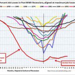
 Ok, the recent unemployment figures in January 2011 were quirky. So, just to give you a sense of the depths of the unemployment “crisis” compared with job losses in other Post WW II recessions….
Calculatedriskblog.com prepared a graph that shows job losses from the start of the employment recession in percentage terms. The dotted line is ex-Census hiring.
For the current employment recession, the graph starts in December 2007, and this recession is by far the worst recession since WWII in percentage terms, and 2nd worst in terms of the unemployment rate. Only the early ’80s recession with a peak of 10.8 percent was worse.


[…] homeowners are experiencing the trauma of loosing their homes in foreclosure. Toxic mortgages, job loss, and other circumstances that have created a foreclosure crisis in the Orlando housing […]