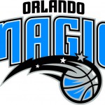
In anticipation of the opening of the team’s new home, the Amway Center, the Orlando Magic have updated its primary logo. This new look ‘turns the page’ on the next chapter in Orlando sports history. As the team and the Magic brand continue to grow, the logo evolves with a stronger, cleaner, more timeless design to match the team’s championship ideals.
 The new logo incorporates the Magic’s current jersey wordmark giving a more integrated look. It also continues the team’s colors with the Magic blue, Magic black and Magic silver. The updated look includes the team’s current secondary logo with the iconic star ball for a smooth transition from old to new, building on the heritage and history of the Magic from its birth in 1989.
“The Orlando Magic is an organization whose mission is for excellence both on and off the court. The jersey worn by our team and represented so well by each of our players is a direct reflection of that excellence, which made for a seamless transition from jersey to logo,” said Magic Chief Operating Officer Alex Martins. “This new logo signifies the beginning of a new era of excellence for the Orlando Magic and our fans. We are excited about where our team is and the direction we are headed as we build on the legend already created and look forward to what the future holds.”
The new logo will make its debut on the Magic’s online team shop, www.orlandomagicshop.com. Magic fans can be the first to wear the new design on hats and T-shirts for 15% off the suggested retail price. This discount on select styles is available at www.orlandomagicshop.com until June 30, 2010 and cannot be used in combination with any other offer or discount.


